Create an Illustrated Look From a Photograph
Mar 12th in Photo Effects by Kyle Pero
In this tutorial, I will show you how the create a stylized illustrated
look from a photograph. The best part is that it requires no artistic
ability! You can do this to any photo and pretty much any subject, but
I think it works best with people.

Kyle
Pero has worked in the creative fields for many years now. With a
background in photography and graphic design he naturally became a
Photoshop whiz. Now he works in advertising doing photographic
retouching, but also does freelance design and illustration work.
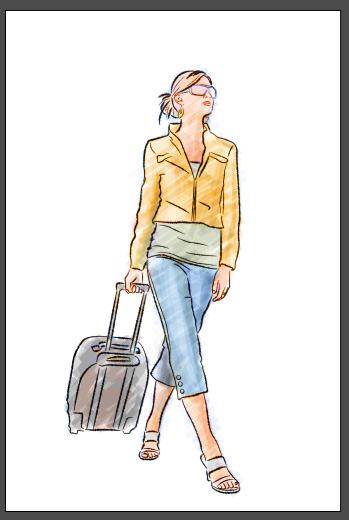
Before/After
You can see a Before/After below (just roll over the image once it's all loaded in). I bought my image from iStockPhoto - here's the item
(Note if you download the sample PSD file from PSDTUTS Plus, the image
has a watermark over it, so you'll need to purchase it and swap it in).
Step One:
Create a new Solid Color Adjustment layer and fill it with White.
Above that layer, create a new blank layer by hitting the New Layer
Button at the bottom of the layer palette. Name that layer "Basic
Shapes." Now turn both of those layers off.
Step Two:
We are going to use the Pen Tool (P) to trace all of the basic
structural elements of the image. In my case, it will be the outline of
the body and the outlines of the clothes.
With the Pen Tool selected, simply click anywhere you would like to
start then continue to click and drag to trace the part you are working
on with the path. To make it look more like a sketch, we are going to
use a lot of small paths rather than trace the whole thing with one
long path. When you come to a place where you think the path should
end, hold down the Cmd (or Ctrl) key ,and click anywhere off the path.
That will deselect it and now you are free to create another one. Keep
doing this until all of your basic shapes are traced. Here are a few
shots of how I traced my image:
A common misconception is that a path needs to be a loop. Not true. We are going to use all "open paths" in this tutorial.
Step Three:
Turn on your white layer and your blank layer. Select the blank
layer. In the paths palette, drag your work path down to the New Path
button at the bottom of the palette to save it. Select the Brush Tool
and open the brushes palette. Select any round, hard brush preset.
Under the Brush Tip Shape section, modify the brush to create a thin
ellipse by bringing the roundness down to 12%. Make the angle 45
degrees. Turn on the Shape Dynamics section bring the Size Jitter to
100, the Minimum diameter to 35, and the Angle Jitter to 5.
With the blank layer still selected, hit D to make black your
foreground color then right/control - click on the path and choose
Stroke Path. Make sure that Simulate Pressure is checked and use Brush
as your source. Hit OK. You might have to adjust the Master Diameter in
the brushes palette if the lines are too thin or thick.
Repeat steps 2 and 3 a few more times, each time getting more and
more detailed in what you trace. The more detail you trace, the thinner
you should set the Master Diameter on the brushes palette. Each time
you do a pass, make sure to apply the stroke onto a new layer.
Step Four:
Now that we have the outlines, let's paint in some color. Duplicate
the the layer that contains your photograph. Put the copy at the top,
above all the other layers. Set the Blending Mode to "Color".
Hit B for the Brush Tool. In the Brushes palette set the Brush Angle
to -45 degrees and turn off the Shape Dynamics. Make the brush a bit
larger.
Make a new blank layer and call it "Paint." Make sure that it's
below all of your outline layers. Make sure that your foreground color
is still set to black. In the properties bar, set the Opacity of the
brush to 10%. Very roughly paint in the color where you want it. Be
sure to release the mouse every now and then so that the color begins
to multiply over itself. Don't worry about staying in the lines too
much. I used a Wacom Tablet so it was easy for me to get nice strokes
but if all you have is a mouse just do the best you can.
Step Five:
Hit E for the Eraser Tool. Set the eraser brush up the same way that
we did the paint brush. Make sure that the eraser brush's Opacity is at
50%. Now go back and tidy up your paint job. I like it when you can
still slightly see the paint going over the lines.
Step Six:
On my image, I want the pants to be blue instead of that peachy
color, so I am going to make a new Hue/Saturation Adjustment layer at
the very top of the layers palette. Drag the Hue slider over until you
get the hue that you like. Adjust the saturation as you like. Wait, the
whole image changed! Thats Ok — we are going to fix that.
Click on the layer mask thumbnail on the Hue/Sat layer and hit Cmd+I
to invert it. The image will go back to the way it was before. Set your
background color to white and select the Eraser Tool. Set the eraser's
opacity to 100% and paint on the mask so that the hue adjustment we
made appears. Now just paint where you want the color shift.
Continue this way until you are happy with the colors.
The shirt adjusted.
The skin tone adjusted.
Step Seven:
Make one more new blank layer just below the "Paint" layer. Call it
"bkg paint". Select the brush tool again and make the master diameter
huge. Mine is at 200. With the brush opacity at 5% do a few really
broad strokes across the whole image just to bring in a little color to
the background.